

Overview
I was tasked with building the visual identity and digital infrastructure for an LA-based streetwear brand called Broken English. The client needed a comprehensive package—from the actual clothing designs to the platform where they would be sold.
The goal was to create a brand that felt gritty, established, and authentic to the LA scene. I acted not just as a designer, but as a strategic partner, advising on marketing angles while executing the technical work quickly and effectively.
- Apparel Design & Direction
- Logo Design (Analog & Digital)
- Shopify Website Development
- Asset Scouting & Mockups


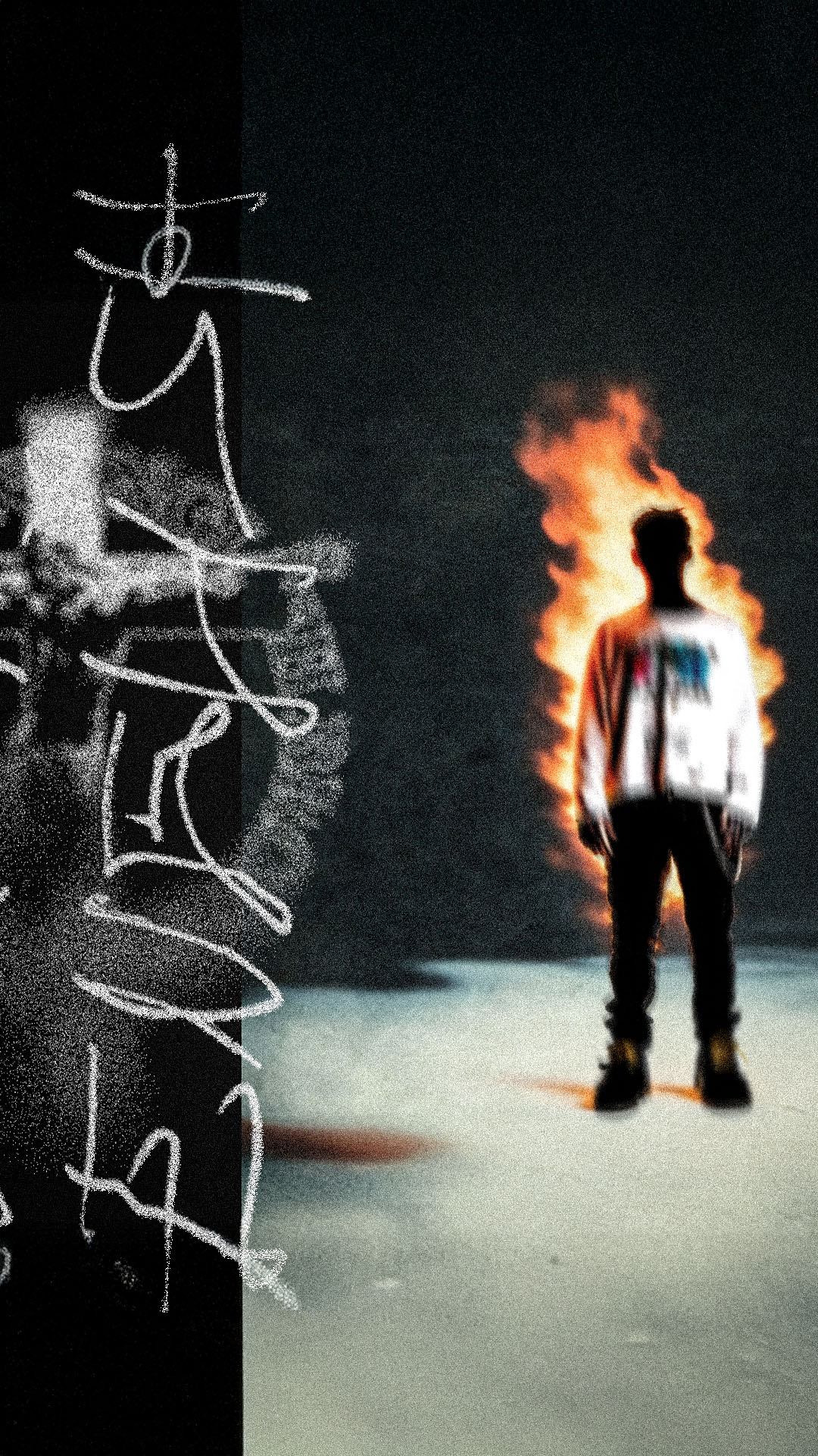
Analog Origins &
Logo Design
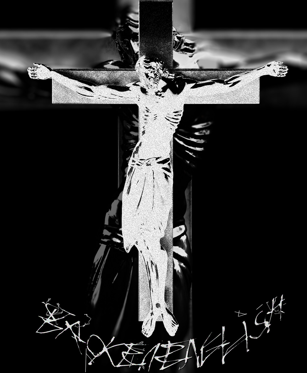
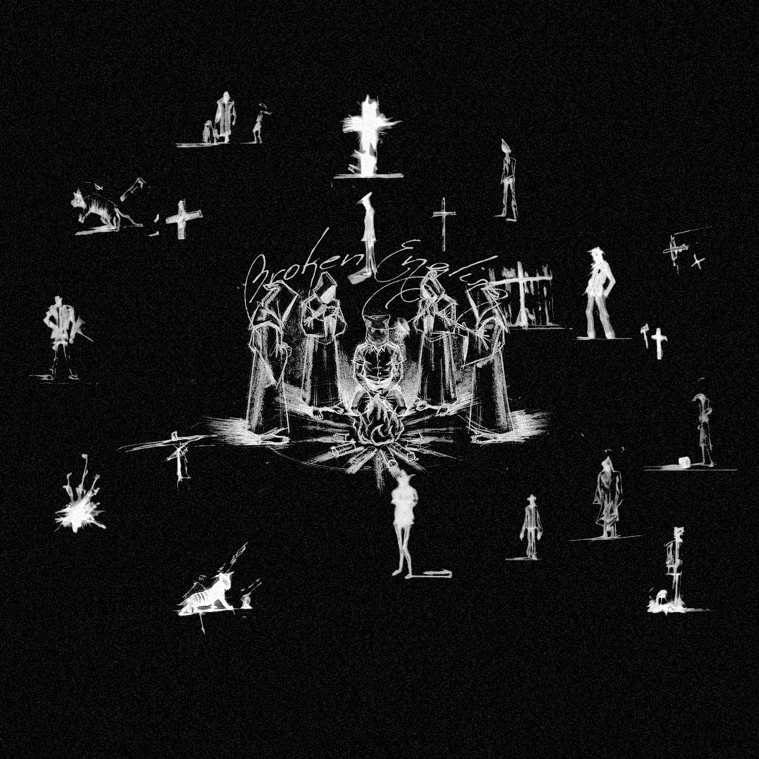
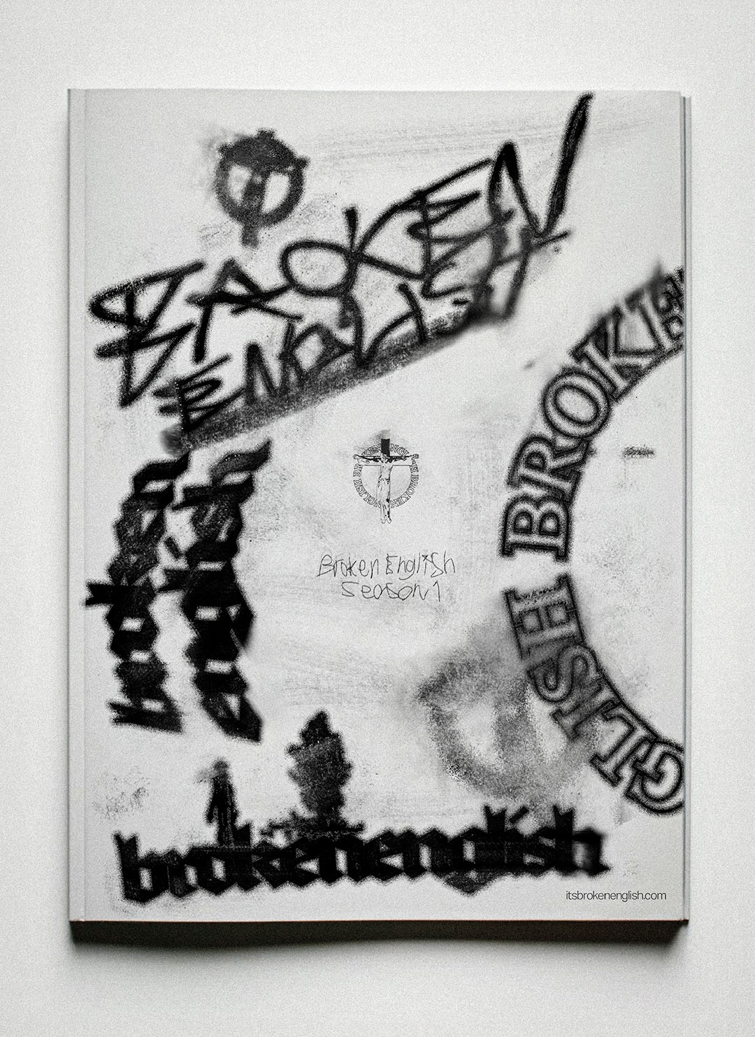
To capture the raw energy the client was looking for, I didn't want to just stick to standard fonts. I started the process with analog writing—using real ink and paper—to generate textures and typography that felt human and slightly "broken."
Once I digitized these assets, I refined them into a logo and brand marks that could sit comfortably on a hoodie or a website header. This process allowed us to move through revisions quickly while keeping a unique "hand-made" feel that separates the brand from generic streetwear.
Developing the
Collection
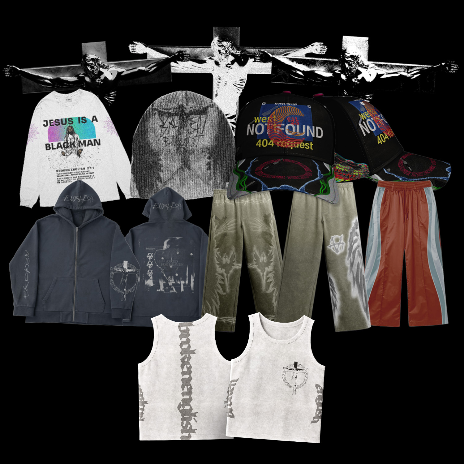
The clothing itself needed to speak a specific language—referencing religious imagery, Y2K aesthetics, and grunge textures.
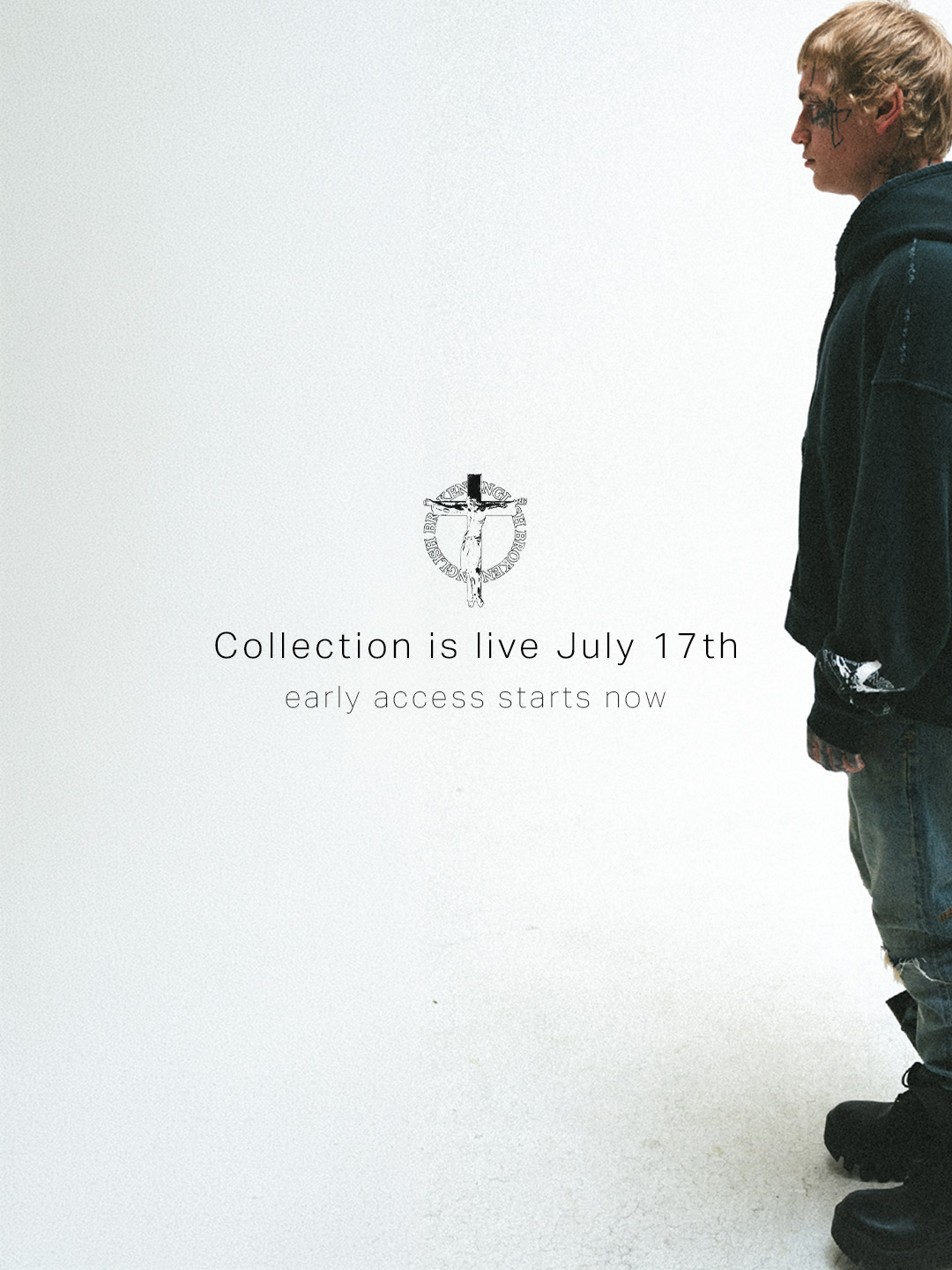
I scouted high-quality mockups that fit this specific vibe; a standard, clean t-shirt mockup wouldn't have done these designs justice. I needed the mockups to look as heavy and washed as the final product would be. We went through multiple rounds of revisions to get the placement and sizing exactly right, ensuring the "Not Found" and "Jesus is a Black Man" graphics hit the right visual impact.
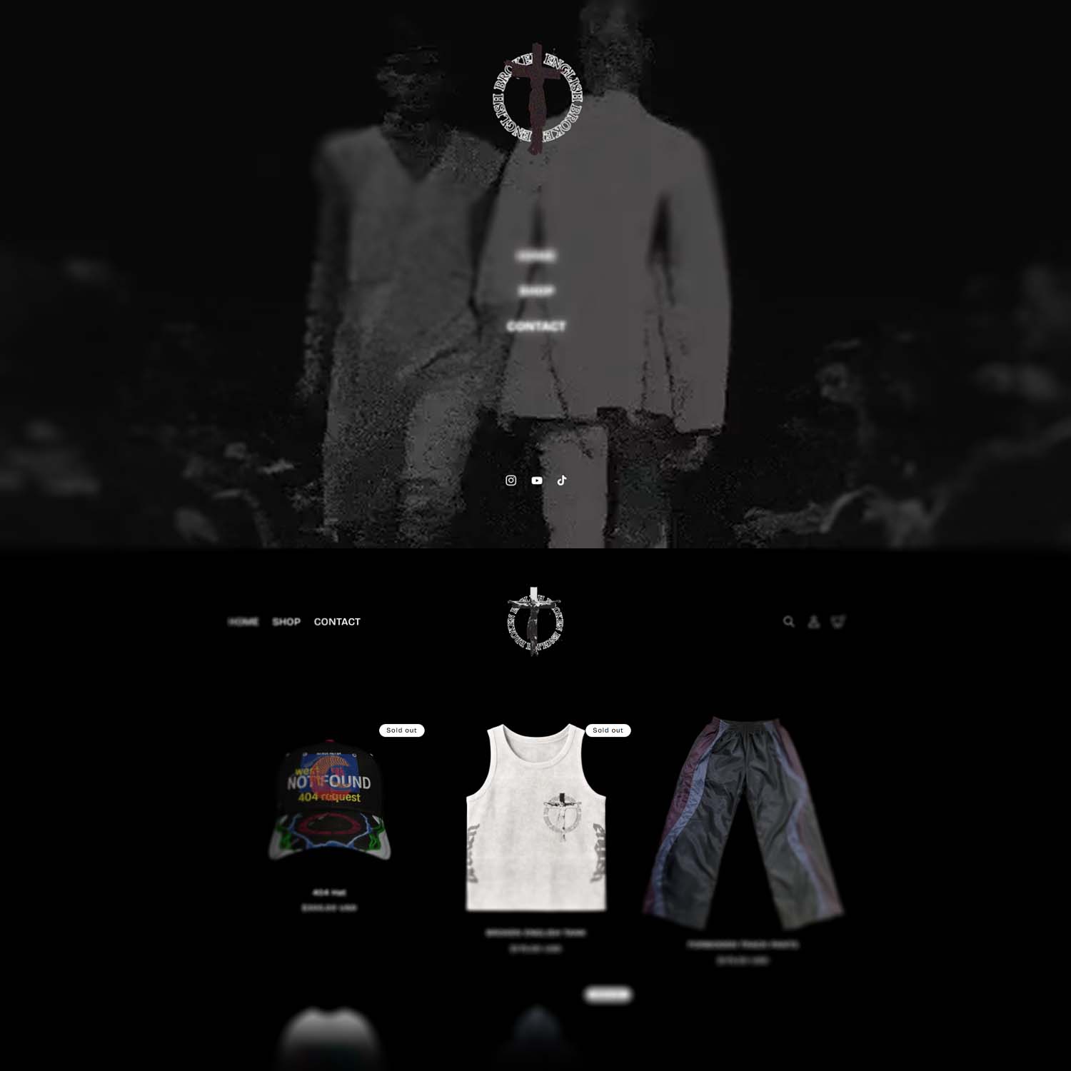
The Shopify Build
It wasn't just about making things look cool; they had to sell. I set up the entire Shopify site from scratch.
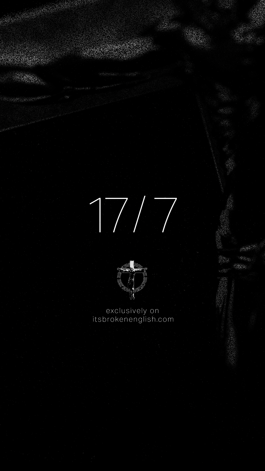
This involved customizing the theme to match the dark, bold aesthetic of the clothing while ensuring the user experience was smooth. I managed the product uploads, layout, and backend settings so the client could hit the ground running immediately upon launch.
RESULTS
This project was a test of versatility. I pride myself on being efficient and hard-working, and I was able to deliver a fully functioning fashion brand ecosystem in a short timeframe.
The client was incredibly happy with the cohesive look—from the tag on a beanie to the checkout page on the site. It was a great experience in combining creative freedom with the technical constraints of e-commerce.
Some of the things I learned include:
- Full-stack branding
- Using analog elements for digital media
- Advising my client through marketing and design
- Finding the right resources for the project
Overview
I was tasked with building the visual identity and digital infrastructure for an LA-based streetwear brand called Broken English. The client needed a comprehensive package—from the actual clothing designs to the platform where they would be sold.
The goal was to create a brand that felt gritty, established, and authentic to the LA scene. I acted not just as a designer, but as a strategic partner, advising on marketing angles while executing the technical work quickly and effectively.
Analog Origins & Logo Design
To capture the raw energy the client was looking for, I didn't want to just stick to standard fonts. I started the process with analog writing—using real ink and paper—to generate textures and typography that felt human and slightly "broken."
Once I digitized these assets, I refined them into a logo and brand marks that could sit comfortably on a hoodie or a website header. This process allowed us to move through revisions quickly while keeping a unique "hand-made" feel that separates the brand from generic streetwear.
Developing the Collection
The clothing itself needed to speak a specific language—referencing religious imagery, Y2K aesthetics, and grunge textures.
I scouted high-quality mockups that fit this specific vibe; a standard, clean t-shirt mockup wouldn't have done these designs justice. I needed the mockups to look as heavy and washed as the final product would be. We went through multiple rounds of revisions to get the placement and sizing exactly right, ensuring the "Not Found" and "Jesus is a Black Man" graphics hit the right visual impact.
The Shopify Build
It wasn't just about making things look cool; they had to sell. I set up the entire Shopify site from scratch.
This involved customizing the theme to match the dark, bold aesthetic of the clothing while ensuring the user experience was smooth. I managed the product uploads, layout, and backend settings so the client could hit the ground running immediately upon launch.
Results
This project was a test of versatility. I pride myself on being efficient and hard-working, and I was able to deliver a fully functioning fashion brand ecosystem in a short timeframe.
The client was incredibly happy with the cohesive look—from the tag on a beanie to the checkout page on the site. It was a great experience in combining creative freedom with the technical constraints of e-commerce.
Get in touch!
Get in touch!